Back

Translation Tool Case Study

Sharon Pradeep

Back

Translation Tool Case Study

Back

Translation Tool Case Study

Translation Tool

(Work under NDA)

One platform, three completely different types of users - Admins, enterprise teams and individual translators. I untangled the experience conflict and rebuilt the interface around a single, unified flow that serves all without compromise.

Translation Tool

(Work under NDA)

One platform, three completely different types of users - Admins, enterprise teams and individual translators. I untangled the experience conflict and rebuilt the interface around a single, unified flow that serves all without compromise.

Translation Tool

(Work under NDA)

One platform, three completely different types of users - Admins, enterprise teams and individual translators. I untangled the experience conflict and rebuilt the interface around a single, unified flow that serves all without compromise.

Project insights

My Role
  • Lead Designer

  • Research and Strategy

  • Design System

The Team
  • Design Manager

  • Lead Designer (me)

  • Design intern

Results
  • 📊 Established success metrics to measure user engagement and efficiency.

  • 🌌 Created a design system from scratch.

  • 📊 Established success metrics to measure user engagement and efficiency.

  • 🌌 Created a design system from scratch.

Overview of the redesigned experience

Overview of the redesigned experience

01 · Introduction
The challenge of growing beyond your original user

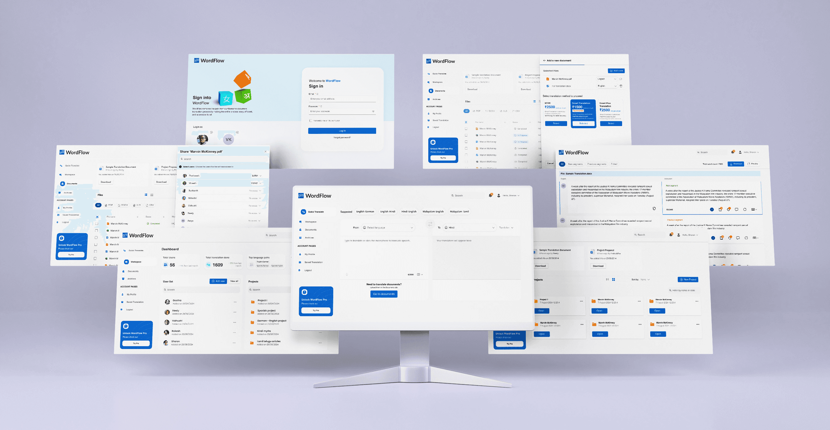
This AI-powered document translation platform is designed to simplify localization for businesses expanding into non-English markets.
 

As user needs evolved, the original interface struggled to accommodate both enterprise-level and casual users. In August 2024, we set out to redesign the platform to create a more efficient, user-friendly experience that meets diverse user requirements.

"We are focused on optimizing the efficiency of our products, prioritizing functionality and ease of use over purely aesthetic considerations."


"We are focused on optimizing the efficiency of our products, prioritizing functionality and ease of use over purely aesthetic considerations."


Founder

This direction was the design north star throughout: every decision had to justify itself through improved efficiency and reduced cognitive load not just visual appeal.

02 · The Problem
What was breaking and for whom

The existing interface was designed around a single mental model: an experienced enterprise user who knows what they need and how to find it. As the user base diversified, four structural problems became visible across all user types.

The old interface

The old interface

Key issues
🔍 Feature Discoverability

Users struggled to find key tools like Quick Translate.

😕 High Task Abandonment

Casual users dropped off due to complexity and poor navigation.

🧭 Fragmented Workflow

Admins lost time switching between multiple screens.

✏️ Limited Edit Control

Content requestors wanted more ability to refine translations.

Desktop View Recommeded

This case study is optimized for desktop to preserve the fidelity of complex design artifacts.

03 · Research
Building an evidence base under constraints

Budget constraints ruled out traditional user interviews with recruited participants. Instead, we combined two sources: hallway usability tests with 10 participants (colleagues, freelancers, and friends who matched our user profiles), and internal usage data provided by the WordFlow team. Critically, we cross-referenced every finding from the hallway tests against the platform data to ensure we weren't designing from biased observations alone.


Where hallway tests revealed what people struggled with, internal data confirmed how often those struggles were happening in the real product giving us confidence in which problems to prioritise.

Testing the current interface

We ran five structured scenarios covering the critical workflows across all three user types:

Scenario Test Case / Task Observed Issues Expected UX Outcome
Add User Add a translator with view-only access to Spanish project Wrong menu clicks, multi-step workflow In-context user management via overlay drawer
Quick Translate Translate “emergency exit” to Japanese Difficulty finding Quick Translate button Prominent Quick Translate landing page with auto-language detection
Edit Document Fix translation of “safety protocol” in a German manual Hidden edit options, inconsistent terms In-line editing with real-time glossary suggestions
Upload & Translate Upload a PDF and estimate translation cost Confusing translation methods, hidden cost calculator Real-time cost preview, unambiguous translation methods
Share Document Share a translated contract with Anand No right-click share menu, manual link copying One-click share button with OS-native dialogs
Personas in practice ; designing for three different worlds

With budget constraints ruling out traditional interviews, we leaned on WordFlow’s internal data to craft three fictional personas:

Marco

Admin user

  • Managing a group of users

  • Overseeing activities and tracking

Tasks

In small organizations admin user can function as content requestor as well

Note

"I need to onboard 5 more translators by Friday"

Shreya

Content requestor

  • Getting documents translated quickly.

  • Verify translated documents

  • Edit translations.

Tasks

Shreya focuses on work efficiency, and will be doing bulk document translations.

Note

"Translating 200-page contracts shouldn’t require a PhD in software."

Mrinalini

Student

  • Getting small text snippets translated quickly.

Tasks

Casual users can be considered as anyone presently using tools like Google translate.

Note

"I just want to check if ‘hidden gem’ translates well to Japanese!”

04 · Success Metrics
Defining what success means before designing it

WordFlow had no formal measurement framework in place prior to this engagement. A key deliverable of this project was establishing four outcome-driven KPIs that created a shared language between design, product, and business stakeholders.


These metrics were not chosen arbitrarily, each was mapped to a specific user problem identified in research, and was designed to give the team a basis for evaluating future iterations with evidence rather than intuition.

👷‍♀️ Task Completion Rate

Measures actual success in translations, file management and other admin related tasks.

⏲️ Time on task

Tracks workflow efficiency

😖 Drop-off rate

Identifies hidden friction points

✅ Accuracy Feedback

Assesses translation quality

05 · Journey Maps
Mapping the journeys

For each user group, we mapped their critical paths through the product, tracking what they're doing, how they're feeling at each step, where friction peaks, and where the biggest design opportunities lie. These aren't exhaustive flows; they're the journeys that shaped the most important design decisions.

Marco

Age: 42

Occupation: Project Manager

Location: Barcelona, Spain

Technical Knowledge: Advanced

User Needs

  • Efficient management of multiple translation projects.
  • Clear visibility into project progress and performance metrics.
  • Seamless integration with other TMS systems.

User Mindsets

  • "I need to ensure our translation projects run smoothly and are completed on time."
  • "It's crucial to have a comprehensive overview of all ongoing projects."
  • "The tools should be intuitive and minimize administrative overhead."
Onboarding
Click ‘Add user button’
Fill user fields
Select languages
Assign projects
GOALS
  • Clear guidance in onboarding procedure
  • Quickly complete onboarding process
  • To add a new user to the system
  • To enter the new user’s details accurately and efficiently.
  • To assign the languages the user can work with or manage.
  • To assign the newly created user to the relevant project(s)
TOUCHPOINTS
  • Login page
  • Organization selection
  • Dashboard
  • Navigaition menu
  • Form fields (name, mobile, email, password, role, status).
  • Add language dialog
  • Project assignment dialog
USER ACTIONS
  • Enters email id
  • Enters password
  • Clicks on login button
  • Navigate through the user management section and click the "Add User" button.
  • Input all required information for the new user
  • Select user roles
  • Define status
  • User select source language
  • User select target language
  • User clicks add button
  • Select relevant projects from the list
EMOTIONS
🙂
"“Let me quickly get into the system and add a user”"
😐
"“Where can i find the button to add a user”"
😟
"“Need to make sure all the information I enter is accurate”"
😟
"“This list is too long, I have to scroll each time to add the languages i want”"
😡
"“I have to again click on this button to find and assign project. When will this process end?”"
KPIs
  • Time on task
  • Time on task
  • Success Rate
  • Time on task
  • Success rate
  • Time on task
  • Success rate
  • Drop-off rate
  • Time on task
  • Success rate
  • Drop-off rate
PAIN POINTS
  • Potential login issues or forgotten credentials.
  • Difficulty locating the button
  • Difficulty understanding the purpose just with the icon
  • Long and tedious fields
  • Poorly arranged project list
  • Long list of languages make it tedious to select required
  • Adding multiple languages require lot of clicks
  • Long list makes it tedious
OPPORTUNITIES
  • Opportunity for improving the speed of accessing the dashboard.
  • Improving the discoverability
  • Improve the process without overwhelming Admins with lot of fields
  • Form validation for making it error free
  • Add search functionality for languages
  • Add option to add multiple languages in one go
  • Enable search or filtering for projects
  • Allow bulk assignment

Shreya

Age: 28

Occupation: Localization Coordinator

Location: Bangalore, India

Technical Knowledge: Intermediate

User Needs

  • User-friendly interface for uploading and managing translation projects.
  • Efficient tools for reviewing and editing translations.

User Mindsets

  • "I want a straightforward platform that allows me to focus on translating rather than figuring out the tool."
  • "I need a clear way to understand and address feedback on my translations."
Onboarding
Upload document
Select translation method
Review translation (optional)
Download document
GOALS
  • Clear guidance in onboarding procedure
  • Quickly complete onboarding process
  • Efficiently upload documents
  • Configure translation settings to meet specific needs
  • Ensure privacy and accuracy in the translation process.
  • Ensure the translation meets quality standards.
  • Easy navigation and editing of the translated text.
  • Finalize the translation process and obtain the final document in the original format
TOUCHPOINTS
  • Login page
  • Organization selection
  • Documents tab
  • File selection dialog
  • File selection dialog
  • Translation selection dropdown
  • 'WordFlow' edit page
  • Documents Tab
  • Documents Tab
  • Archives Tab
USER ACTIONS
  • Enters email id
  • Enters password
  • Clicks on login button
  • User selects the upload button
  • User selects the file(s) to be translated
  • User selects Output Language
  • Select between Machine/Human/Smart Translations.
  • Select LSP
  • Chooses Privacy
  • User Preview the translated document
  • User edits the translation to correct any errors or improve accuracy.
  • User approves the translation.
  • User downloads the translated document.
EMOTIONS
😄
"“I need to log in quickly and get to my translations”"
😟
"“Where do I upload my file?”"
😡
"“Is it not done yet?”"
😟
"“This edit process is tedious.”"
😐
"“I hope the download works without issues.”"
KPIs
  • Time on task
  • Time on task
  • Success Rate
  • Time on task
  • Success rate
  • Time on task
  • Time on task
  • Success rate
  • Accuracy Feedback
PAIN POINTS
  • Potential login issues or forgotten credentials.
  • Difficulty locating the button
  • Difficulty understanding the purpose just with the icon.
  • Issues with pasting text from other sources
  • Unsure about the differences between options
  • Slow response time for translation results.
  • Errors or inaccuracies in the translation.
OPPORTUNITIES
  • Opportunity for improving the speed of accessing the dashboard
  • Improving the discoverability
  • Redirection to document translation for larger text
  • Easy and auto detection of options
  • Real time feedbacks of translation
  • Option to give feedback

Mrinalini

Age: 22

Occupation: College Student

Location: Delhi, India

Technical Knowledge: Basic

User Needs

  • Quick and easy translations for small documents and text snippets.
  • Simple interface with minimal configuration.
  • Reliable and accurate machine translation.

User Mindsets

  • "I need a fast way to translate small pieces of text without dealing with complex settings."
  • "Accuracy is important, but I also want the translation process to be quick and easy."
  • "If needed, I want to be able to make quick adjustments to the translation."
Onboarding
Discovery of Try Translation button
Adding text snippets
Choosing options
Execution
GOALS
  • Clear guidance in onboarding procedure
  • Quickly complete onboarding process
  • Quickly fetch translation result
  • Simple and user friendly text input process.
  • Understand and choose the desired mode.
  • Quickly and easily select the correect languages.
  • Immediate and accurate translation results.
  • Smooth execution process without errors.
TOUCHPOINTS
  • Login page
  • Organization selection
  • Documents tab
  • 'Try Translation' screen
  • Input Fields
  • 'Try Translation' screen
  • Language dropdown, options dropdown
  • 'Try Translation' screen
USER ACTIONS
  • Enters email id
  • Enters password
  • Clicks on login button
  • Find the 'Try translation' button.
  • Click on 'Try translation' button
  • Choose between Text and Speech to Text.
  • Enter the text to be translated
  • Select b/w translation or transiliteration.
  • Select the source and output language.
  • Click the button to see the translation result.
EMOTIONS
🙂
""Let me quickly get into the system and find the translation""
😟
""Where is the quick translation feature""
😐
""What are my options for translation""
😐
""I need to choose the right languages""
😄
""I hope the translation is quick and accurate""
KPIs
  • Time on task
  • Time on task
  • Success Rate
  • Time on task
  • Success rate
  • Time on task
  • Time on task
  • Success rate
  • Accuracy Feedback
PAIN POINTS
  • Potential login issues or forgotten credentials.
  • Difficulty locating the button
  • Difficulty understanding the purpose just with the icon.
  • Issues with pasting text from other sources
  • Unsure about the differences between options
  • Slow response time for translation results.
  • Errors or inaccuracies in the translation.
OPPORTUNITIES
  • Opportunity for improving the speed of accessing the dashboard
  • Improving the discoverability
  • Redirection to document translation for larger text
  • Easy and auto detection of options
  • Real time feedbacks of translation
  • Option to give feedback

Note: A representative selection of journey maps are shown. The full backlog is not displayed.

06 · User Stories
Turning journey insights into design requirements

From the journey maps, we developed user stories that gave the team a shared language for prioritizing design decisions. Shown here is a representative selection — the stories that had the most direct influence on what we built.

🧑‍💼 As an admin user, I want to add new users to the system so that they can start using WordFlow for translation tasks
Marco
🔐 As an admin user, I want to edit user roles and permissions so that i can control their access and capabilities within the platform
Marco
📚 As an Admin User, I want to manage terminology list so that our translations maintain consistency and accuracy across all documents.
Marco
📂 As a content requester, I want to upload a new document for translations that I can get the content translated into the desired language.
Shreya
💰 As a content requester I want to see a cost estimate for different translation methods before translating so I can make an informed decision.
Shreya
✏️ As a content requester, I want to review the translation for spelling errors and terminology inconsistencies to ensure accuracy and consistency.
Shreya
⚡As a casual translator I want to quickly translate text snippets so that I can understand the meaning in another language instantly.
Mrinalini
🌐 As a casual translator I want to select from a wide range of languages so that I can translate content to and from languages I need.
Mrinalini
💾 As a casual translator, I want to save my frequently used translations so that I can refer to them later without re-entering the text.
Mrinalini

Note: A representative selection of user stories is shown. The full backlog is not displayed.

07 · Information Architecture
Restructuring the navigation from three silos to one shell

The original navigation was structured around feature categories — which made sense from an engineering perspective but created siloed experiences for each user type. Admins lived in one corner; translators in another; casual users couldn't locate their entry point at all.

The redesigned IA uses a single shared navigation shell with a role-adaptive default state. Every user enters the same product — but their starting screen and dashboard content adjust based on their role. No features are hidden; every user can reach any section. The difference is where they land, not what they can access.

Before — Fragmented navigation
Dashboard Admin only
User Management
Terminology
Documents Requestors
Upload
Archive
Quick Translate Buried
Settings
After — Unified shell, role-adaptive defaults
Quick Translate All users · Default for casual
Documents All users · Except casual translators
Upload & Translate
Review & Edit
Archive
Dashboard All users · Except casual translators
User Management
Terminology Library
Analytics
Settings All users
08 · Design Decisions
What changed and why

Each solution traces directly to a problem identified in research. Below are the four major redesign areas, with the reasoning that connects user need to design decision.

Quick Translate Overhaul

User Scenario

Casual users were abandoning the product entirely due to discoverability failures. Quick Translate — the feature they needed most — was buried with an unrecognizable icon that gave no affordance.

Solution

✅Made Quick Translate the default landing page post-login.
 

✅Added auto-language detection and voice input options.
 

✅Introduced "Save Translation" overlay for quick access later.
 

✅Added an on-screen keyboard for typing in local/international languages.
 

✅Integrated a feedback system for real-time translation quality insights.

Quick Translate

Voice Input

Saving a translation

On-screen keyboard

Unified Admin Dashboard

User Scenario

Admins like Marco were spending significant time navigating between disconnected screens to manage users, review activity, and maintain terminology libraries. Every context switch cost focus and time.

Solution

✅Introduced centralized dashboard showing total translations, top language pairs, and costs.


✅Added overlay drawers for adding/removing users without losing context.


✅Simplified terminology management workflows via quick-access term libraries.

Separate metrices for different users

Adding a new user

User list

Terminology management

Term Library

Document Management Redesign

User Scenario

Shreya's team handled bulk document translation regularly. The original interface didn't support multi-file uploads, hid cost estimates until after submission, and presented translation method options (Machine / Human / Smart) without meaningful differentiation — leading to hesitation and drop-off.

Solution

✅Implemented drag-and-drop upload functionality with multi-document support for bulk uploads.


✅Embedded real-time cost previews during file selection so users can make informed decisions upfront.


✅Differentiated translation methods visually so content teams can choose based on speed or accuracy needs.


✅Enabled editing capabilities within translated documents when quality falls short.

The document section transformation.

(Moved away from its spreadsheet-like appearance toward a more intuitive workspace model.)

Clearly distinguishable translation methods and their respective value propositions.

Documents - navigation

Uploading a document

Sharing a document

Editing a document

User Scenario

Content teams consistently needed to refine translation output — but the original interface offered no editing capability. The only options were accept or reject. For high-stakes documents like legal contracts, this was a blocker.

Solution

✅Introduced segment-wise editing, allowing users to edit translations at a granular level.


✅Added fuzzy matches to highlight segments that closely match existing translations but may require minor adjustments.


✅Integrated a glossary replacement feature, enabling users to quickly replace inconsistent terms with approved glossary entries.

✅Enabled commenting within segments, allowing team members to leave feedback or notes for collaborators during the review process.

Uploading a document

09 · Design System
Building the foundation for scale

A platform serving three user types with distinct workflows requires a design system that can express those differences without fragmenting the visual language. We built WordFlow's design system from scratch — covering tokens, components, typography, spacing, and interaction states — with the intent that first-party and third-party teams could extend it without custom one-offs.


Key decisions in the system include a shared component library with role-context variants (e.g. the dashboard card adapts its data display based on user type while using identical structure), and a consistent overlay pattern that unifies user management, terminology editing, and document sharing under one interaction model.

Excerpts from design system
10 · Outcomes
What the redesign delivered

The project was delivered to the WordFlow team in August 2024, after which the client took full ownership of implementation. Formal post-launch measurement is ongoing on their side. What we can point to are the design-level outcomes — each traceable to a specific KPI established at the start of the project.

😖 Drop-off Rate
Quick Translate as the default landing page

Directly removes the primary drop-off trigger for casual users: inability to locate the feature. The redesign eliminates navigation as a prerequisite for the core use case.

⏲️ Time on Task
Overlay drawers replacing multi-screen flows

User management and terminology editing now happen in-context. Admins no longer lose their place navigating between screens to complete a single task.

👷‍♀️ Task Completion Rate
Real-time cost preview and method clarity

Content teams can now make informed translation method decisions before uploading — removing the hesitation and abandonment that came from committing without information.

✅ Accuracy Feedback
Segment editing and in-product feedback

For the first time, content teams have the tools to act on translation quality issues directly. The feedback loop between quality perception and improvement is now closed.

11 · Reflections
What I'd carry forward, and what I'd change
What worked well
KPIs as a design tool, not a reporting tool

Framing success metrics before designing — and tying each KPI to a specific user problem — kept decisions grounded throughout the project. It also made stakeholder conversations faster: we weren't debating opinions, we were debating hypotheses against shared criteria.

What worked well
The overlay drawer pattern

Using a consistent overlay pattern for all in-context actions (user management, terminology editing, document sharing) gave the product a coherent interaction vocabulary. It made admin workflows dramatically more efficient while keeping the system learnable.

What I'd do differently
Push for one real enterprise admin in testing

Content teams can now make informed translation method decisions before uploading — removing the hesitation and abandonment that came from committing without information.

What I'd do differently
Design the measurement infrastructure alongside

We defined KPIs but left measurement tooling to the client post-handoff. In hindsight, proposing a lightweight analytics instrumentation plan alongside the design — even just event tagging recommendations — would have made impact measurement much more likely to happen.

Open questions we'd want to test

01

Does making Quick Translate the default landing page create confusion for enterprise users who arrive with documents ready to upload? Does the navigation architecture recover them quickly, or do they need orientation?

02

Segment-level editing is a powerful feature — but is it discoverable enough without instruction? Do first-time users find and use it when their translation quality falls short, or do they still abandon?

03

The translation method differentiation (Machine / Human / Smart) was redesigned to be scannable. Does the new framing actually reduce decision hesitation, or do users still need more guidance before selecting?

Explore other projects

© 2026 Sharon Pradeep. Hand-crafted in Figma & Framer

Built in Framer

© 2026 Sharon Pradeep. Hand-crafted in Figma & Framer

Built in Framer

© 2026 Sharon Pradeep. Hand-crafted in Figma & Framer

Built in Framer